10 TIPS FOR AN ACCESSIBLE AND SOCIAL WEBSITE
•
14 recomendaciones•1,285 vistas

A website that works? 10 tips for a usable website.

Recomendados
Recomendados
Más contenido relacionado
La actualidad más candente
La actualidad más candente (20)
Destacado
Destacado (20)
Similar a 10 TIPS FOR AN ACCESSIBLE AND SOCIAL WEBSITE
Similar a 10 TIPS FOR AN ACCESSIBLE AND SOCIAL WEBSITE (20)
Más de Bart De Waele
Más de Bart De Waele (20)
Último
Último (20)
10 TIPS FOR AN ACCESSIBLE AND SOCIAL WEBSITE
- 1. A WEBSITE THAT WORKS
- 2. Good afternoon! My name is Bart.
- 3. I work at web agency Netlash. ... and a few other companies:
- 4. this is my daughter Merel
- 5. I’m passionate about coffee
- 6. You can find me at: ‣ www.netlash.com ‣ www.ondernemeringent.be ‣ www.mereldewaele.be ‣ www.kopjekoffie.be ‣ www.twitter.com/netlash (Yes, that’s a lot of www.)
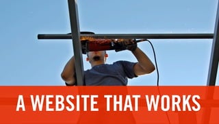
- 7. A WEBSITE THAT WORKS 10 tips for a usable website
- 8. Any new technology knows 3 waves: copy - translate - own
- 9. The web is finding its own language ‣ it’s not a brochure ‣ it’s not a videoclip ‣ it’s certainly not radio (podcast is dead)
- 10. No 10 tips (lots more)
- 11. I will give you 8 basic principles
- 12. 8 consistency content typography accessibility portability technology speed interaction
- 13. 1. Consistency
- 14. Expectations ‣ logo ‣ ‘home’ ‣ breadcrumb ‣ disclaimer ‣ searchbox ‣ navigation ‣ language
- 15. 1. Consistency
- 16. Logo ‣ top left ‣ with tagline (optional) ‣ with link to homepage
- 17. Language ‣ top left, below the logo ‣ ISO (NL-FR-EN) ‣ show all options
- 18. Home ‣ first in main navigation, in logo ‣ is expected ‣ English terminology is ok!
- 19. Breadcrumb ‣ below main navigation ‣ shows the travelled path ‣ clickable, except last item
- 20. Searchbox ‣ top right ‣ dangerous! ‣ user expects Google
- 21. Navigation ‣ preferably top horizontal ‣ subnavigation at the left ‣ not done: right or bottom
- 22. Secondary navigation ‣ bottom, in footer ‣ privacy statement, sitemap ‣ for bigger sites: contact webmaster, about
- 23. Consistency gives people grip It’s clear for them: ‣ where they came from ‣ where they are now ‣ where they can go in a visual language they know from other sites
- 24. 1. Consistency
- 25. 8 consistency content typography accessibility portability technology speed interaction
- 26. 2. Typography
- 27. The web is text For the moment, people are still writing more to each other than they are using the phone.
- 28. Line length ‣ no infinitely long lines ‣ +- 55 characters per line ‣ so: no liquid design
- 31. Scalable fonts ‣ let users scale fonts themselves ‣ no pixel values (use relative) ‣ a-A is nothing more than a band aid
- 32. Serif or Sans-serif? On screen: sans-serif. ed ut perspiciatis unde omnis iste ed ut perspiciatis unde omnis natus error sit voluptatem iste natus error sit voluptatem accusantium doloremque accusantium doloremque laudantium, totam rem aperiam, laudantium, totam rem aperiam, eaque ipsa quae ab illo inventore eaque ipsa quae ab illo veritatis et quasi architecto beatae inventore veritatis et quasi vitae dicta sunt explicabo. Nemo architecto beatae vitae dicta enim ipsam voluptatem quia sunt explicabo. Nemo enim
- 33. 8 consistency content typography accessibility portability technology speed interaction
- 34. 3. Portability
- 35. Mohammed and the mountain don’t try to lure visitors to your website spread your content to those places that already have visitors
- 40. RSS ‣ Really Simple Syndication ‣ makes content portable ‣ http://nl.wikipedia.org/wiki/Really_Simple_Syndication
- 41. API ‣ Application Programming Interface ‣ gives third parties access to your data ‣ http://nl.wikipedia.org/wiki/Application_Programming_Interface
- 42. 8 consistency content typography accessibility portability technology speed interaction
- 43. 4. Speed
- 44. Visitors are impatient ‣ load fast (technical speed) ‣ to the point (speed of content) ‣ scannable (structural speed)
- 46. 8 consistency content typography accessibility portability technology speed interaction
- 47. 5. Content
- 48. New!
- 49. 5. Content
- 50. 5. Content “A website is like underwear. Refresh every day.”
- 51. Publish on a regular basis ‣ follow a set pattern ‣ value and relevancy ‣ news
- 52. CMS ‣ use a Content Management System ‣ update your website: NOT via IT!
- 53. 8 consistency content typography accessibility portability technology speed interaction
- 54. 6. Accessibility
- 55. Build an accessible site ‣ usable ‣ cross-browser and cross-platform ‣ AnySurfer ‣ Google ‣ Facebook
- 56. Usable ‣ user centered design ‣ user testing ‣ usability
- 57. Cross-browser ‣ works on PC/Apple/Linux ‣ works on IE/Firefox/Safari/Opera/Chrome ‣ iPad! ‣ Mobile!
- 58. AnySurfer ‣ www.anysurfer.be
- 59. Google ‣ biggest traffic driver ‣ SEO-friendly!
- 60. Facebook ‣ ‘like’ ‣ search engine
- 61. 8 consistency content typography accessibility portability technology speed interaction
- 62. 7. Technology
- 63. There will always be new technology ‣ Flash - Flex - Air ‣ Ajax ‣ HTML 5 ‣ Video
- 64. Technology should not be a driver think hard about the value
- 65. 8 consistency content typography accessibility portability technology speed interaction
- 66. 8. Interaction
- 67. Let your audience participate ‣ tests, applications, forms ‣ feedback mechanisms (rating, review) ‣ comments, forum ‣ let them even contribute content! (Ooooh!)
- 68. 8 consistency content typography accessibility portability technology speed interaction
- 69. Hey Bart! What about that Web 2.0 and Social thing?
- 70. 8 consistency content typography accessibility portability technology speed interaction social
- 71. 9. Social
- 72. Web 2.0 removes the artifical membrane between the organisation and the public.
- 73. “Web 2.0 is an architecture of participation.” Tim O’Reilly
- 74. Web 2.0 = people Site-centric User-centric
- 75. The “Soylent Green” moment.
- 76. The web is people The “Soylent Green” moment.
- 77. The web is used by people.
- 78. Real people, not ‘users’
- 81. Web 2.0 = people So treat them as people: conversation
- 82. Conversation
- 83. (Ok, so maybe there are 10 tips after all)
- 84. 8 consistency content typography accessibility portability technology speed interaction social conversation
- 85. Questions?