CSS Grid Changes Everything About Web Layouts: WordCamp Europe 2017

Slides from the WordCamp Europe presentation by the same name. From the conference website: CSS Grid is now live in all major browsers, and with it everything we know about web layouts changes! Imagine drawing a grid in the browser and placing content in one or any number of cells without having to change the HTML or source order. And imagine changing that grid on the fly using media queries or JavaScript while keeping the HTML markup clean and accessible. That’s what CSS Grid does, and that’s why you should be using it today. The CSS Grid Layout Module introduces a native CSS grid system, provided at the viewport level, that achieves what CSS frameworks and popular grid systems could only dream about: Responsive, flexible, pure CSS grid layouts, independent of document source order, that allow us to treat the browser as a true design and layout surface. In this talk you’ll get an intro to CSS Grid and learn how it changes pretty much everything when it comes to layouts on the web. Through examples, code snippets, and practical demos you’ll learn how to use CSS Grid in a theme for modern responsive layouts, and you’ll also learn how to handle older browsers without Grid support in a clean and straight-forward way. CSS Grid is here, and you can start using it today. This talk shows you how to do it right.

Recomendados
Más contenido relacionado
La actualidad más candente
La actualidad más candente (20)
Similar a CSS Grid Changes Everything About Web Layouts: WordCamp Europe 2017
Similar a CSS Grid Changes Everything About Web Layouts: WordCamp Europe 2017 (20)
Más de Morten Rand-Hendriksen
Más de Morten Rand-Hendriksen (14)
Último
Último (17)
CSS Grid Changes Everything About Web Layouts: WordCamp Europe 2017
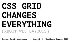
- 1. CSS GRID CHANGES EVERYTHING (ABOUT WEB LAYOUTS) Morten Rand-Hendriksen | @mor10 | WordCamp Europe 2017
- 2. mor10.com/wceu2017 SLIDES, LINKS, ETC: @mor10 #CSSGrid #WCEU
- 8. Question: HOW WOULD YOU CREATE THIS LAYOUT USING ONLY CSS?
- 10. <h1 class="page-title"></h1> <div class="container"> <main></main> <div class="sidebar"> <header></header> <section> <aside></aside> <footer></footer> </section> </div><!-- .sidebar --> </div><!-- .container -->
- 12. Web layouts are broken. We’ve just refined how we break them.
- 14. .main-content .sidebar .wrap.wrap { border: 5px solid red; } .main-content { background: blue; } .sidebar { background: green; }
- 15. .main-content .sidebar .wrap.wrap { border: 5px solid red; } .main-content { width: 45%; float: left; background: blue; } .sidebar { width: 45%; float: right; background: green; }
- 16. .main-content .sidebar .wrap.wrap { border: 5px solid red; } .main-content { width: 45%; float: left; background: blue; } .sidebar { width: 45%; float: right; background: green; } /* Clearfix */ .wrap:after { content: ""; display: table; clear: both; }
- 17. .main-content .sidebar .wrap.wrap { display: flex; justify-content: space-between; border: 5px solid red; } .main-content { width: 45%; background: blue; } .sidebar { width: 45%; background: green; }
- 20. .main-content .sidebar .wrap.wrap { display: flex; justify-content: space-between; border: 5px solid red; } .container { width: 45%; } .main-content { background: blue; } .other-content { background: purple; } .sidebar { width: 45%; background: green; } .container .other-content
- 21. This is a hack. float and flex force us to create HTML clutter in the form of wrappers like the .container element in this example. .main-content .sidebar .wrap .container .other-content
- 22. This is web layouts today. float and flex have been the two only options for creating horizontal layouts resulting in the web suffering from a severe case of Divitis. .main-content .sidebar .wrap .container .other-content
- 24. Paal Joachim Romdahl on Advanced WordPress Group
- 25. underscores.me
- 26. <div class="page"> <header class="site-header"></header> <div class="site-content"> <div class="content-area"> <main class="main-content"> <article class="post"></article> <nav class="post-navigation"></nav> <div class="comments-area"></div> </main> </div> <aside class="widget-area"></aside> </div> <footer class="site-footer"></footer> </div>
- 27. <div class="site"> <header class="site-header"> <div class="site-content"> <footer class="site-footer"> <div class="content-area"> <aside class="widget-area"> <main class="site-main"> <article class="post"> <nav class="post-nav…"> <div class="comments…">
- 28. <div class="site"> <header class="site-header"> <div class="site-content"> <footer class="site-footer"> <div class="content-area"> <aside class="widget-area"> <main class="site-main"> <article class="post"> <nav class="post-nav…"> <div class="comments…">
- 29. <div class="site"> <header class="site-header"> <div class="site-content"> <footer class="site-footer"> <div class="content-area"> <aside class="widget-area"> <main class="site-main"> <article class="post"> <nav class="post-nav…"> <div class="comments…">
- 30. <div class="site"> <header class="site-header"> <footer class="site-footer"> <aside class="widget-area"><main class="site-main"> <article class="post"> <nav class="post-nav…"> <div class="comments…">
- 31. <div class="page"> <header class="site-header"></header> <div class="site-content"> <div class="content-area"> <main class="main-content"> <article class="post"></article> <nav class="post-navigation"></nav> <div class="comments-area"></div> </main> </div> <aside class="widget-area"></aside> </div> <footer class="site-footer"></footer> </div>
- 32. <div class="page"> <header class="site-header"></header> <main class="main-content"> <article class="post"></article> <nav class="post-navigation"></nav> <div class="comments-area"></div> </main> <aside class="widget-area"></aside> <footer class="site-footer"></footer> </div>
- 33. <h1 class="page-title"></h1> <div class="container"> <main></main> <div class="sidebar"> <header></header> <section> <aside></aside> <footer></footer> </section> </div><!-- .sidebar --> </div><!-- .container -->
- 34. <h1 class="page-title"></h1> <div class="container"> <main></main> <div class="sidebar"> <header></header> <section> <aside></aside> <footer></footer> </section> </div><!-- .sidebar --> </div><!-- .container -->
- 36. Problem: Current tools for web layout are content-out and one-dimensional. Solution: Two-dimensional layout-in tool to separate content from presentation.
- 38. <header class="masthead"> </header> <h1 class="page-title"> </h1> <main class="main-content"> </main> <aside class="sidebar"> </aside> <footer class="footer"> </footer> .masthead .page-title .main-content .sidebar .footer
- 39. <header class="masthead"> </header> <h1 class="page-title"> </h1> <main class="main-content"> </main> <aside class="sidebar"> </aside> <footer class="footer"> </footer>
- 41. • Grid container • Grid item • Grid line • Grid cell • Grid track • Grid area • Grid gap CSS Grid Terminology:
- 42. Element containing a grid, defined by setting display: grid; Grid container <div class="site"> <header class="masthead"> </header> <h1 class="page-title"> </h1> <main class="main-content"> </main> <aside class="sidebar"> </aside> <footer class="footer"> </footer> </div><!-- .site -->
- 43. Element that is a direct descendant of the grid container. Grid item <div class="site"> <header class="masthead"> </header> <h1 class="page-title"> </h1> <main class="main-content"> </main> <aside class="sidebar"> </aside> <footer class="footer"> </footer> </div><!-- .site -->
- 44. Horizontal (row) or vertical (column) line separating the grid into sections. Grid line
- 45. Grid lines are referenced by number, starting and ending with the outer borders of the grid. Grid line 1 2 3 4 5 6 1 2 3 4 5 6
- 46. The intersection between a grid row and a grid column. Effectively the same as a table cell. Grid cell
- 47. Rectangular area between four specified grid lines. Grid areas can cover one or more cells. Grid area
- 48. The space between two or more adjacent grid lines. Row tracks are horizontal, Column tracks vertical. Grid track
- 49. Empty space between grid tracks (shown in blue). Commonly called gutters. Grid gap 1 2 3 4 5 6 1 2 3 4 5 6
- 50. 1. Define a grid. 2. Place items within the grid. 3. Make world peace. CSS Grid in a Nutshell:
- 51. <div class="site"> <header class="masthead"> </header> <h1 class="page-title"> </h1> <main class="main-content"> </main> <aside class="sidebar"> </aside> <footer class="footer"> </footer> </div><!-- .site --> .masthead .page-title .main-content .sidebar .footer .site
- 52. <div class="site"> </div><!-- .site --> .masthead .page-title .main-content .sidebar .footer .site
- 53. Creates a grid container. display: grid;
- 55. Draws grid lines. Takes list of length values (em, px, %, fr, etc.) denoting the distance between each line. grid-template-columns grid-template-rows
- 56. .site 2 fractions 1 fraction each 2fr 1fr 1fr .site { display: grid; grid-template-columns: 2fr 1fr 1fr; }
- 57. .site Fit content auto 1 fraction 1fr 3 fractions 3fr .site { display: grid; grid-template-columns: 2fr 1fr 1fr; grid-template-rows: auto 1fr 3fr; }
- 58. .masthead .page- title .main- content .sidebar .footer .site.site { display: grid; grid-template-columns: 2fr 1fr 1fr; grid-template-rows: auto 1fr 3fr; } Grid items automatically populate grid from top left to bottom right based on HTML source order.
- 59. Applied to grid items. Defines the start and end grid lines for columns and rows. grid-column: 1/3; grid-row: 2/4;
- 60. .site 1 2 3 4 Start at column line 2. End at column line 4. .site { display: grid; grid-template-columns: 2fr 1fr 1fr; grid-template-rows: auto 1fr 3fr; } .masthead { grid-column: 2/4; } .masthead
- 61. .masthead .site.site { display: grid; grid-template-columns: 2fr 1fr 1fr; grid-template-rows: auto 1fr 3fr; } .masthead { grid-column: 2/4; grid-row: 2/3; } 1 2 3 4 Start at row line 2. End at row line 3.
- 62. .site.site { display: grid; grid-template-columns: 2fr 1fr 1fr; grid-template-rows: auto 1fr 3fr; } .masthead { grid-column: 2/4; grid-row: 2/3; } .page-title { grid-column: 1/4; grid-row: 1/2; } .main-content { grid-column: 1/2; grid-row: 2/4; } /* etc etc */ 1 2 3 4 1 2 3 4 .page-title .main-content .sidebar .footer .masthead
- 63. Naysayer to your left Looks promising, but remembering what lines to target seems tricky… especially when the site is responsive.
- 65. Applied to grid container. Uses a text- based grid map to apply grid area names to individual cells. grid-template-areas
- 66. .site.site { display: grid; grid-template-columns: 2fr 1fr 1fr; grid-template-rows: auto 1fr 3fr; grid-template-areas: "title title title" "main header header" "main sidebar footer"; } title title title main main header header sidebar footer
- 67. Specifies what grid area the element is placed within. grid-area: [area name];
- 68. title title title main main header header sidebar footer .page-title .main-content .sidebar .footer .masthead .site.site { display: grid; grid-template-columns: 2fr 1fr 1fr; grid-template-rows: auto 1fr 3fr; grid-template-areas: "title title title" "main header header" "main sidebar footer"; } .masthead { grid-area: header; } .page-title { grid-area: title; } .main-content { grid-area: main; } /* etc etc */
- 69. RWD anno 2017
- 70. .site { display: grid; grid-template-columns: 1fr 1fr; grid-template-rows: auto 1fr 3fr; grid-template-areas: "title title" "main header" "main sidebar"; } .masthead { grid-area: header; } .page-title { grid-area: title; } .main-content { grid-area: main; } .sidebar { grid-area: sidebar; } .footer { grid-area: footer; } @media screen and (min-width: 34em) { .site { grid-template-columns: 2fr 1fr 1fr; grid-template-areas: "title title title" "main header header" "main sidebar footer"; } }
- 71. .site .page-title .main-content .sidebar .footer .masthead .site .page-title .main-content .sidebar .footer .masthead .site .masthead .page-title .main-content .sidebar .footer No grid Two-column grid Three-column grid
- 73. Girds are not inherited by child elements. Instead we create nested grids. Nested grids
- 74. Your boss / client … but older browsers!
- 75. http://caniuse.com/#search=grid Grid is supported in all modern browsers.
- 76. Everyone right now I still think it’s too soon.
- 78. The elephants in the room
- 79. Internet Explorer 101 and Edge2 lag behind* 1 IE10 uses the original Grid specification. 2 Edge is adopting the modern specification as we speak. * Fun fact: CSS Grid was invented by Microsoft for IE10.
- 80. Use feature queries to test for grid support in the current browser. @supports (display: grid) { … } Current recommendation:
- 81. Test for grid-area instead, because Edge lies about grid support. @supports (grid-area: auto) { … } My recommendation:
- 82. Everyone right now But wait! That means the site won’t look the same in all browsers!!!!!
- 83. If it works here… … it works here as well!
- 84. Forcing sites to look the same across all browsers is just a bad habit.
- 85. Thanks to RWD we’ve been serving up different layouts for different browsers since 2010.
- 86. Accessible mobile- first layouts work well on all screen widths.
- 88. 1. Build accessible mobile-first layout without grid. 2. Use mobile-first layout as fallback for all browsers. 3. Use @supports to detect grid support. 4. At the appropriate breakpoint, create layout with grid and grid-areas. 5. Explore new layouts as viewport widens. CSS Grid: A Practical Approach for Today
- 89. Your path to CSS Grid:
- 90. Firefox has a grid inspector! https://goo.gl/SJmlms
- 91. Rachel Andrew’s Grid by Example is doctrine. https://gridbyexample.com/
- 93. CSS Tricks has a Complete Guide to CSS Grid. https://goo.gl/Z01gjF
- 94. Kuhn, my theme using CSS grid, is on GitHub to give you ideas. https://goo.gl/URouSh
- 95. Building Production-Ready CSS Grid Layouts Today by yours truly at Smashing Magazine https://goo.gl/dae838
- 96. Go where you want the web to go and the rest will follow.
- 97. CSS Grid means you can finally use proper grid systems for your designs! DESIGNERS
- 98. Start using CSS Grid today even if that means adding fallbacks for older browsers. THEME DEVELOPERS
- 99. Cure your Divitis with a solid dose of CSS Grid. FRAMEWORK PEOPLE
- 100. This is make or break time. Gutenberg + CSS Grid is changing the game. Get moving. PAGE BUILDERS
- 101. SET BEST PRACTICES
- 102. BE RESPONSIBLE
- 103. BUILD THE WEB YOU WISH TO SEE
- 104. REPEAT AFTER ME:
- 105. 1. Make it accessible. 2. Make it fancy. 3. Make sure the fancy doesn’t break accessibility.
- 106. CSS GRID CHANGES EVERYTHING GO GET YOUR GRID ON TODAY! https://mor10.com/wceu2017