SlideShare una empresa de Scribd logo
1 de 29
Presentation
on
GRAPHICAL REPRESENTATION OF
STATISTICAL DATA
BY
MD SAMSER ALI
15BEDB042/KC
Meaning Of Graphical Representation Of Data
 A picture is said to be more effective than words for describing a
particular thing.
 A graphic representation is the geometrical image of a set of data .
 It is a mathematical picture.
 It enables us to think about a statistical problem in visual terms.
 It is an effective and economic device for the presentation ,
understanding and interpretation of the collected data.
IMPOTANCE OF GRAPHICAL REPRESENTATION
 It is used to make the data understandable to common
man.
 It helps in easy and quick understanding of data.
 Data displayed by graphical representation can be
memorised for a long time.
 Can be compared at a glance.
TYPES OF GRAPHICAL REPRESENTATION
Ungrouped
Data
Line Graph
Bar Graph
Pie Diagram Or
Circle Graph
Grouped
Data
Histogram
Frequency
Polygon
Frequency
Curve
Line graph:
line graphs are simple Mathematical
graphs that are drawn on the
graph paper by plotting the data
connecting one variable on the
horizontal X- axis and other
variable of data on the vertical
Y-axis.
EXAMPLE:
Time 10
am
11
am
12
pm
1 pm 2 pm 3 pm 4 pm 5 pm 6
pm
No of
People
2 6 10 22 15 5 4 4 3
Bar graph:
In bar graphs data is represented by bars.
The bars can be made in any direction i.e. vertical or horizontal.
The bars are taken of equal weight and start from a common
horizontal or vertical line and their length indicates the
corresponding values of statistical data.
When do we use bar diagram ?
 When the data are given in whole numbers.
 When the data are to be compared easily.
How To Make A Bar Graph ?
Months Jan Feb Mar Apr May June Jul Aug
No. of buses
manufacture
d
600 800 1000 1200 1400 1600 1800 1800
Pie diagram:
It is a circle in which different components are represented
through the sections or portions of a circle.
To draw a pie diagram, first the value of each category is
expressed as a percentage of the total and then the angle 360⁰ is
divided in the same percentages.
Then at the centre of a circle these angle are drawn
simultaneously starting from a particular radius.
In this way we get a set of sectorial areas proportional to the
values of the items.
When do we use pie diagram?
 When the data are given in percentage.
 When different aspect of a variable are to be displayed.
 When the data are to be compared normally.
HOW TO MAKE A PIE DIAGRAM ?
EXAMPLE:
(Table: the result of class 10 of a school)
Marks
Division
First Second Third Failures
% of student 20% 56% 20% 4%
201.6
72
14.4
72
second div. first div.
failure third div.
Marks
Division
% of
student
Approx . Angle in
degree
First 20%
Second 56%
Third 20%
Failures 4%
HISTOGRAM:
 A histogram is essentially a bar graph of a frequency
distribution.
 It can be constructed for equal as well as unequal class
intervals.
 Area of any rectangle of a histogram is proportional to the
frequency of that class.
When do we use histogram ?
When data are given in the form of frequencies.
When class interval has to be displayed by a diagram.
When we need to calculate the Mode of a distribution
graphically.
How to make Histogram ?
Histogram for equal class width:
Class
Interval
(Height in
cm)
Freq
.
155-160 3
160-165 2
165-170 9
170-175 7
175-180 10
180-185 5
185-190 5
190-195 1
Histogram for unequal class width:
Class
bound
ary
Fre
que
ncy
Class
Widt
h
Frequency
Density
0-10 8 10
10-15 6 5
15-20 12 5
20-24 14 4
24-35 7 11
35-40 3 5
Calculation of MODE through Histogram
Mode = OQ
Mode = 35
1st straight line :
𝑦−20
𝑥−40
=
25−20
30−40
CALCULATION 0F MODE
 40,20 and (30,25)
 (30,20) and (40,25)
=> 𝑦 − 20 =
5
10
∗ 𝑥 − 40
……………. (1)
2nd Straight line :
𝑦 − 20
𝑥 − 30
=
25 − 20
40 − 30
=> 𝑦 − 20 = −
5
10
∗ 𝑥 − 30
…………(2)
Solving equations (1) and (2) ,
we get
𝒙 = 𝟑𝟓
FREQUENCY PLOGON:
A frequency polygon is essentially a line graph .
 We can get it from a histogram, if the mid points of the upper bases
of the rectangles are connected by straight lines.
 But it is not essential to plot a histogram first to draw it.
 We can construct it directly from a given frequency distribution.
When do we use Frequency polygon?
o When data are given in the form of frequencies.
oWhen two or more groups have to be displayed in one
diagram.
o When two or more groups are to be compared.
How to draw frequency polygon?
Height in
Cm
(class
interval)
Mid
value
frequen
cy
150-154 152 10
154-158 156 15
158-162 160 20
162-166 164 12
166-170 168 8
Two or more groups can be compared through
Frequency Polygon
FREQUENCY CURVE:
 Frequency curve is another type of graphical representation of data.
 When then top points of a frequency polygon are joined not by
straight lines but by curved ones.
 Frequency polygon is drawn using scale while while Frequency
curve is drawn using free hand.
When the number of class intervals are very large i.e.,width of the
class intervals are very small and the total number of sample values
be increased indefinitely.
When do we use frequency curve ?
FREQUENCY POLYGON
V/S
FREQUENCY CURVE
CONCLUSION
So we can conclude that statistical data may be
presented in a more attractive form with the help
of some graphic aids i.e., pictures and diagrams
which carries a lot of communication power and
the task of understand and interpretation of data
becomes simple, accurate and practicable.
Graphical Representation of Statistical data

Más contenido relacionado

La actualidad más candente

La actualidad más candente (20)

Biostatistics Frequency distribution
Biostatistics Frequency distributionBiostatistics Frequency distribution
Biostatistics Frequency distribution
 
Standard deviation
Standard deviationStandard deviation
Standard deviation
 
Type i and type ii errors
Type i and type ii errorsType i and type ii errors
Type i and type ii errors
 
Frequency Polygon
Frequency PolygonFrequency Polygon
Frequency Polygon
 
Correlation
CorrelationCorrelation
Correlation
 
LEVEL OF SIGNIFICANCE.pptx
LEVEL OF SIGNIFICANCE.pptxLEVEL OF SIGNIFICANCE.pptx
LEVEL OF SIGNIFICANCE.pptx
 
Skewness and kurtosis
Skewness and kurtosisSkewness and kurtosis
Skewness and kurtosis
 
Types of graphs
Types of graphsTypes of graphs
Types of graphs
 
Descriptive statistics
Descriptive statisticsDescriptive statistics
Descriptive statistics
 
Graphical representation of data mohit verma
Graphical representation of data mohit verma Graphical representation of data mohit verma
Graphical representation of data mohit verma
 
Hypothesis and its types
Hypothesis and its typesHypothesis and its types
Hypothesis and its types
 
coefficient correlation
 coefficient correlation coefficient correlation
coefficient correlation
 
Tabulation of data
Tabulation of dataTabulation of data
Tabulation of data
 
Diagrammatic presentation of data
Diagrammatic presentation of dataDiagrammatic presentation of data
Diagrammatic presentation of data
 
Regression
RegressionRegression
Regression
 
Anova ppt
Anova pptAnova ppt
Anova ppt
 
Introduction to biostatistics
Introduction to biostatisticsIntroduction to biostatistics
Introduction to biostatistics
 
Measure OF Central Tendency
Measure OF Central TendencyMeasure OF Central Tendency
Measure OF Central Tendency
 
Measures of Dispersion
Measures of DispersionMeasures of Dispersion
Measures of Dispersion
 
Analysis of variance (anova)
Analysis of variance (anova)Analysis of variance (anova)
Analysis of variance (anova)
 

Similar a Graphical Representation of Statistical data

Qt graphical representation of data
Qt   graphical representation of dataQt   graphical representation of data
Qt graphical representation of dataJoel Pais
 
Qt graphical representation of data
Qt   graphical representation of dataQt   graphical representation of data
Qt graphical representation of dataJoel Pais
 
Quantitative techniques in business
Quantitative techniques in businessQuantitative techniques in business
Quantitative techniques in businesssameer sheikh
 
Numerical and statistical methods new
Numerical and statistical methods newNumerical and statistical methods new
Numerical and statistical methods newAabha Tiwari
 
PRESENTATION OF DATA.pptx
PRESENTATION OF DATA.pptxPRESENTATION OF DATA.pptx
PRESENTATION OF DATA.pptxajesh ps
 
Diagrammatic and Graphical Representation of Data in Statistics
Diagrammatic and Graphical Representation of Data in StatisticsDiagrammatic and Graphical Representation of Data in Statistics
Diagrammatic and Graphical Representation of Data in StatisticsAsha Dhilip
 
Graphical representation of Data in Research.pdf
Graphical representation of Data in Research.pdfGraphical representation of Data in Research.pdf
Graphical representation of Data in Research.pdfsoniasehrawat5
 
Lecture 2-PPT.pdf
Lecture 2-PPT.pdfLecture 2-PPT.pdf
Lecture 2-PPT.pdfRAJKAMAL282
 
Lecture 2-PPT statistics.pdf
Lecture 2-PPT statistics.pdfLecture 2-PPT statistics.pdf
Lecture 2-PPT statistics.pdfDrSJayashree
 
PG STAT 531 Lecture 3 Graphical and Diagrammatic Representation of Data
PG STAT 531 Lecture 3 Graphical and Diagrammatic Representation of DataPG STAT 531 Lecture 3 Graphical and Diagrammatic Representation of Data
PG STAT 531 Lecture 3 Graphical and Diagrammatic Representation of DataAashish Patel
 
Data Presentation using Descriptive Graphs.pptx
Data Presentation using Descriptive Graphs.pptxData Presentation using Descriptive Graphs.pptx
Data Presentation using Descriptive Graphs.pptxJeanettebagtoc
 
633e639cc8efda0018e1ca63_##_Graphical Representation 01 _ Class Notes __ (Vic...
633e639cc8efda0018e1ca63_##_Graphical Representation 01 _ Class Notes __ (Vic...633e639cc8efda0018e1ca63_##_Graphical Representation 01 _ Class Notes __ (Vic...
633e639cc8efda0018e1ca63_##_Graphical Representation 01 _ Class Notes __ (Vic...pawankumar802140
 
Statistical Methods: Graphical Representation of Data
Statistical Methods: Graphical Representation of DataStatistical Methods: Graphical Representation of Data
Statistical Methods: Graphical Representation of DataDr. Ramkrishna Singh Solanki
 
Graphical Presentation of Data - Rangga Masyhuri Nuur LLU 27.pptx
Graphical Presentation of Data - Rangga Masyhuri Nuur LLU 27.pptxGraphical Presentation of Data - Rangga Masyhuri Nuur LLU 27.pptx
Graphical Presentation of Data - Rangga Masyhuri Nuur LLU 27.pptxRanggaMasyhuriNuur
 
Diagramatic Representation.pdf
Diagramatic Representation.pdfDiagramatic Representation.pdf
Diagramatic Representation.pdfgarefed500
 
Graphicalrepresntationofdatausingstatisticaltools2019_210902_105156.pdf
Graphicalrepresntationofdatausingstatisticaltools2019_210902_105156.pdfGraphicalrepresntationofdatausingstatisticaltools2019_210902_105156.pdf
Graphicalrepresntationofdatausingstatisticaltools2019_210902_105156.pdfHimakshi7
 

Similar a Graphical Representation of Statistical data (20)

Statistics
StatisticsStatistics
Statistics
 
Qt graphical representation of data
Qt   graphical representation of dataQt   graphical representation of data
Qt graphical representation of data
 
Qt graphical representation of data
Qt   graphical representation of dataQt   graphical representation of data
Qt graphical representation of data
 
Quantitative techniques in business
Quantitative techniques in businessQuantitative techniques in business
Quantitative techniques in business
 
Numerical and statistical methods new
Numerical and statistical methods newNumerical and statistical methods new
Numerical and statistical methods new
 
PRESENTATION OF DATA.pptx
PRESENTATION OF DATA.pptxPRESENTATION OF DATA.pptx
PRESENTATION OF DATA.pptx
 
Diagrammatic and Graphical Representation of Data in Statistics
Diagrammatic and Graphical Representation of Data in StatisticsDiagrammatic and Graphical Representation of Data in Statistics
Diagrammatic and Graphical Representation of Data in Statistics
 
Graphical representation of Data in Research.pdf
Graphical representation of Data in Research.pdfGraphical representation of Data in Research.pdf
Graphical representation of Data in Research.pdf
 
seminar.pptx
seminar.pptxseminar.pptx
seminar.pptx
 
Lecture 2-PPT.pdf
Lecture 2-PPT.pdfLecture 2-PPT.pdf
Lecture 2-PPT.pdf
 
Lecture 2-PPT statistics.pdf
Lecture 2-PPT statistics.pdfLecture 2-PPT statistics.pdf
Lecture 2-PPT statistics.pdf
 
PG STAT 531 Lecture 3 Graphical and Diagrammatic Representation of Data
PG STAT 531 Lecture 3 Graphical and Diagrammatic Representation of DataPG STAT 531 Lecture 3 Graphical and Diagrammatic Representation of Data
PG STAT 531 Lecture 3 Graphical and Diagrammatic Representation of Data
 
Charts and graphs
Charts and graphsCharts and graphs
Charts and graphs
 
Data Presentation using Descriptive Graphs.pptx
Data Presentation using Descriptive Graphs.pptxData Presentation using Descriptive Graphs.pptx
Data Presentation using Descriptive Graphs.pptx
 
633e639cc8efda0018e1ca63_##_Graphical Representation 01 _ Class Notes __ (Vic...
633e639cc8efda0018e1ca63_##_Graphical Representation 01 _ Class Notes __ (Vic...633e639cc8efda0018e1ca63_##_Graphical Representation 01 _ Class Notes __ (Vic...
633e639cc8efda0018e1ca63_##_Graphical Representation 01 _ Class Notes __ (Vic...
 
Statistical Methods: Graphical Representation of Data
Statistical Methods: Graphical Representation of DataStatistical Methods: Graphical Representation of Data
Statistical Methods: Graphical Representation of Data
 
Graphical Presentation of Data - Rangga Masyhuri Nuur LLU 27.pptx
Graphical Presentation of Data - Rangga Masyhuri Nuur LLU 27.pptxGraphical Presentation of Data - Rangga Masyhuri Nuur LLU 27.pptx
Graphical Presentation of Data - Rangga Masyhuri Nuur LLU 27.pptx
 
Diagramatic Representation.pdf
Diagramatic Representation.pdfDiagramatic Representation.pdf
Diagramatic Representation.pdf
 
Graphicalrepresntationofdatausingstatisticaltools2019_210902_105156.pdf
Graphicalrepresntationofdatausingstatisticaltools2019_210902_105156.pdfGraphicalrepresntationofdatausingstatisticaltools2019_210902_105156.pdf
Graphicalrepresntationofdatausingstatisticaltools2019_210902_105156.pdf
 
Graphs in Biostatistics
Graphs in Biostatistics Graphs in Biostatistics
Graphs in Biostatistics
 

Último

Q4 English4 Week3 PPT Melcnmg-based.pptx
Q4 English4 Week3 PPT Melcnmg-based.pptxQ4 English4 Week3 PPT Melcnmg-based.pptx
Q4 English4 Week3 PPT Melcnmg-based.pptxnelietumpap1
 
GRADE 4 - SUMMATIVE TEST QUARTER 4 ALL SUBJECTS
GRADE 4 - SUMMATIVE TEST QUARTER 4 ALL SUBJECTSGRADE 4 - SUMMATIVE TEST QUARTER 4 ALL SUBJECTS
GRADE 4 - SUMMATIVE TEST QUARTER 4 ALL SUBJECTSJoshuaGantuangco2
 
call girls in Kamla Market (DELHI) 🔝 >༒9953330565🔝 genuine Escort Service 🔝✔️✔️
call girls in Kamla Market (DELHI) 🔝 >༒9953330565🔝 genuine Escort Service 🔝✔️✔️call girls in Kamla Market (DELHI) 🔝 >༒9953330565🔝 genuine Escort Service 🔝✔️✔️
call girls in Kamla Market (DELHI) 🔝 >༒9953330565🔝 genuine Escort Service 🔝✔️✔️9953056974 Low Rate Call Girls In Saket, Delhi NCR
 
Computed Fields and api Depends in the Odoo 17
Computed Fields and api Depends in the Odoo 17Computed Fields and api Depends in the Odoo 17
Computed Fields and api Depends in the Odoo 17Celine George
 
Field Attribute Index Feature in Odoo 17
Field Attribute Index Feature in Odoo 17Field Attribute Index Feature in Odoo 17
Field Attribute Index Feature in Odoo 17Celine George
 
Judging the Relevance and worth of ideas part 2.pptx
Judging the Relevance  and worth of ideas part 2.pptxJudging the Relevance  and worth of ideas part 2.pptx
Judging the Relevance and worth of ideas part 2.pptxSherlyMaeNeri
 
USPS® Forced Meter Migration - How to Know if Your Postage Meter Will Soon be...
USPS® Forced Meter Migration - How to Know if Your Postage Meter Will Soon be...USPS® Forced Meter Migration - How to Know if Your Postage Meter Will Soon be...
USPS® Forced Meter Migration - How to Know if Your Postage Meter Will Soon be...Postal Advocate Inc.
 
Gas measurement O2,Co2,& ph) 04/2024.pptx
Gas measurement O2,Co2,& ph) 04/2024.pptxGas measurement O2,Co2,& ph) 04/2024.pptx
Gas measurement O2,Co2,& ph) 04/2024.pptxDr.Ibrahim Hassaan
 
ENGLISH 7_Q4_LESSON 2_ Employing a Variety of Strategies for Effective Interp...
ENGLISH 7_Q4_LESSON 2_ Employing a Variety of Strategies for Effective Interp...ENGLISH 7_Q4_LESSON 2_ Employing a Variety of Strategies for Effective Interp...
ENGLISH 7_Q4_LESSON 2_ Employing a Variety of Strategies for Effective Interp...JhezDiaz1
 
ECONOMIC CONTEXT - LONG FORM TV DRAMA - PPT
ECONOMIC CONTEXT - LONG FORM TV DRAMA - PPTECONOMIC CONTEXT - LONG FORM TV DRAMA - PPT
ECONOMIC CONTEXT - LONG FORM TV DRAMA - PPTiammrhaywood
 
Roles & Responsibilities in Pharmacovigilance
Roles & Responsibilities in PharmacovigilanceRoles & Responsibilities in Pharmacovigilance
Roles & Responsibilities in PharmacovigilanceSamikshaHamane
 
Influencing policy (training slides from Fast Track Impact)
Influencing policy (training slides from Fast Track Impact)Influencing policy (training slides from Fast Track Impact)
Influencing policy (training slides from Fast Track Impact)Mark Reed
 
Keynote by Prof. Wurzer at Nordex about IP-design
Keynote by Prof. Wurzer at Nordex about IP-designKeynote by Prof. Wurzer at Nordex about IP-design
Keynote by Prof. Wurzer at Nordex about IP-designMIPLM
 
Inclusivity Essentials_ Creating Accessible Websites for Nonprofits .pdf
Inclusivity Essentials_ Creating Accessible Websites for Nonprofits .pdfInclusivity Essentials_ Creating Accessible Websites for Nonprofits .pdf
Inclusivity Essentials_ Creating Accessible Websites for Nonprofits .pdfTechSoup
 
How to Add Barcode on PDF Report in Odoo 17
How to Add Barcode on PDF Report in Odoo 17How to Add Barcode on PDF Report in Odoo 17
How to Add Barcode on PDF Report in Odoo 17Celine George
 
Difference Between Search & Browse Methods in Odoo 17
Difference Between Search & Browse Methods in Odoo 17Difference Between Search & Browse Methods in Odoo 17
Difference Between Search & Browse Methods in Odoo 17Celine George
 

Último (20)

Q4 English4 Week3 PPT Melcnmg-based.pptx
Q4 English4 Week3 PPT Melcnmg-based.pptxQ4 English4 Week3 PPT Melcnmg-based.pptx
Q4 English4 Week3 PPT Melcnmg-based.pptx
 
GRADE 4 - SUMMATIVE TEST QUARTER 4 ALL SUBJECTS
GRADE 4 - SUMMATIVE TEST QUARTER 4 ALL SUBJECTSGRADE 4 - SUMMATIVE TEST QUARTER 4 ALL SUBJECTS
GRADE 4 - SUMMATIVE TEST QUARTER 4 ALL SUBJECTS
 
FINALS_OF_LEFT_ON_C'N_EL_DORADO_2024.pptx
FINALS_OF_LEFT_ON_C'N_EL_DORADO_2024.pptxFINALS_OF_LEFT_ON_C'N_EL_DORADO_2024.pptx
FINALS_OF_LEFT_ON_C'N_EL_DORADO_2024.pptx
 
YOUVE GOT EMAIL_FINALS_EL_DORADO_2024.pptx
YOUVE GOT EMAIL_FINALS_EL_DORADO_2024.pptxYOUVE GOT EMAIL_FINALS_EL_DORADO_2024.pptx
YOUVE GOT EMAIL_FINALS_EL_DORADO_2024.pptx
 
call girls in Kamla Market (DELHI) 🔝 >༒9953330565🔝 genuine Escort Service 🔝✔️✔️
call girls in Kamla Market (DELHI) 🔝 >༒9953330565🔝 genuine Escort Service 🔝✔️✔️call girls in Kamla Market (DELHI) 🔝 >༒9953330565🔝 genuine Escort Service 🔝✔️✔️
call girls in Kamla Market (DELHI) 🔝 >༒9953330565🔝 genuine Escort Service 🔝✔️✔️
 
Model Call Girl in Tilak Nagar Delhi reach out to us at 🔝9953056974🔝
Model Call Girl in Tilak Nagar Delhi reach out to us at 🔝9953056974🔝Model Call Girl in Tilak Nagar Delhi reach out to us at 🔝9953056974🔝
Model Call Girl in Tilak Nagar Delhi reach out to us at 🔝9953056974🔝
 
Computed Fields and api Depends in the Odoo 17
Computed Fields and api Depends in the Odoo 17Computed Fields and api Depends in the Odoo 17
Computed Fields and api Depends in the Odoo 17
 
Field Attribute Index Feature in Odoo 17
Field Attribute Index Feature in Odoo 17Field Attribute Index Feature in Odoo 17
Field Attribute Index Feature in Odoo 17
 
Judging the Relevance and worth of ideas part 2.pptx
Judging the Relevance  and worth of ideas part 2.pptxJudging the Relevance  and worth of ideas part 2.pptx
Judging the Relevance and worth of ideas part 2.pptx
 
USPS® Forced Meter Migration - How to Know if Your Postage Meter Will Soon be...
USPS® Forced Meter Migration - How to Know if Your Postage Meter Will Soon be...USPS® Forced Meter Migration - How to Know if Your Postage Meter Will Soon be...
USPS® Forced Meter Migration - How to Know if Your Postage Meter Will Soon be...
 
Gas measurement O2,Co2,& ph) 04/2024.pptx
Gas measurement O2,Co2,& ph) 04/2024.pptxGas measurement O2,Co2,& ph) 04/2024.pptx
Gas measurement O2,Co2,& ph) 04/2024.pptx
 
ENGLISH 7_Q4_LESSON 2_ Employing a Variety of Strategies for Effective Interp...
ENGLISH 7_Q4_LESSON 2_ Employing a Variety of Strategies for Effective Interp...ENGLISH 7_Q4_LESSON 2_ Employing a Variety of Strategies for Effective Interp...
ENGLISH 7_Q4_LESSON 2_ Employing a Variety of Strategies for Effective Interp...
 
Raw materials used in Herbal Cosmetics.pptx
Raw materials used in Herbal Cosmetics.pptxRaw materials used in Herbal Cosmetics.pptx
Raw materials used in Herbal Cosmetics.pptx
 
ECONOMIC CONTEXT - LONG FORM TV DRAMA - PPT
ECONOMIC CONTEXT - LONG FORM TV DRAMA - PPTECONOMIC CONTEXT - LONG FORM TV DRAMA - PPT
ECONOMIC CONTEXT - LONG FORM TV DRAMA - PPT
 
Roles & Responsibilities in Pharmacovigilance
Roles & Responsibilities in PharmacovigilanceRoles & Responsibilities in Pharmacovigilance
Roles & Responsibilities in Pharmacovigilance
 
Influencing policy (training slides from Fast Track Impact)
Influencing policy (training slides from Fast Track Impact)Influencing policy (training slides from Fast Track Impact)
Influencing policy (training slides from Fast Track Impact)
 
Keynote by Prof. Wurzer at Nordex about IP-design
Keynote by Prof. Wurzer at Nordex about IP-designKeynote by Prof. Wurzer at Nordex about IP-design
Keynote by Prof. Wurzer at Nordex about IP-design
 
Inclusivity Essentials_ Creating Accessible Websites for Nonprofits .pdf
Inclusivity Essentials_ Creating Accessible Websites for Nonprofits .pdfInclusivity Essentials_ Creating Accessible Websites for Nonprofits .pdf
Inclusivity Essentials_ Creating Accessible Websites for Nonprofits .pdf
 
How to Add Barcode on PDF Report in Odoo 17
How to Add Barcode on PDF Report in Odoo 17How to Add Barcode on PDF Report in Odoo 17
How to Add Barcode on PDF Report in Odoo 17
 
Difference Between Search & Browse Methods in Odoo 17
Difference Between Search & Browse Methods in Odoo 17Difference Between Search & Browse Methods in Odoo 17
Difference Between Search & Browse Methods in Odoo 17
 

Graphical Representation of Statistical data

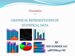
  • 1. Presentation on GRAPHICAL REPRESENTATION OF STATISTICAL DATA BY MD SAMSER ALI 15BEDB042/KC
  • 2. Meaning Of Graphical Representation Of Data  A picture is said to be more effective than words for describing a particular thing.  A graphic representation is the geometrical image of a set of data .  It is a mathematical picture.  It enables us to think about a statistical problem in visual terms.  It is an effective and economic device for the presentation , understanding and interpretation of the collected data.
  • 3. IMPOTANCE OF GRAPHICAL REPRESENTATION  It is used to make the data understandable to common man.  It helps in easy and quick understanding of data.  Data displayed by graphical representation can be memorised for a long time.  Can be compared at a glance.
  • 4. TYPES OF GRAPHICAL REPRESENTATION Ungrouped Data Line Graph Bar Graph Pie Diagram Or Circle Graph Grouped Data Histogram Frequency Polygon Frequency Curve
  • 5. Line graph: line graphs are simple Mathematical graphs that are drawn on the graph paper by plotting the data connecting one variable on the horizontal X- axis and other variable of data on the vertical Y-axis. EXAMPLE: Time 10 am 11 am 12 pm 1 pm 2 pm 3 pm 4 pm 5 pm 6 pm No of People 2 6 10 22 15 5 4 4 3
  • 6. Bar graph: In bar graphs data is represented by bars. The bars can be made in any direction i.e. vertical or horizontal. The bars are taken of equal weight and start from a common horizontal or vertical line and their length indicates the corresponding values of statistical data. When do we use bar diagram ?  When the data are given in whole numbers.  When the data are to be compared easily.
  • 7. How To Make A Bar Graph ?
  • 8. Months Jan Feb Mar Apr May June Jul Aug No. of buses manufacture d 600 800 1000 1200 1400 1600 1800 1800
  • 9. Pie diagram: It is a circle in which different components are represented through the sections or portions of a circle. To draw a pie diagram, first the value of each category is expressed as a percentage of the total and then the angle 360⁰ is divided in the same percentages. Then at the centre of a circle these angle are drawn simultaneously starting from a particular radius. In this way we get a set of sectorial areas proportional to the values of the items.
  • 10. When do we use pie diagram?  When the data are given in percentage.  When different aspect of a variable are to be displayed.  When the data are to be compared normally.
  • 11. HOW TO MAKE A PIE DIAGRAM ?
  • 12. EXAMPLE: (Table: the result of class 10 of a school) Marks Division First Second Third Failures % of student 20% 56% 20% 4%
  • 13. 201.6 72 14.4 72 second div. first div. failure third div. Marks Division % of student Approx . Angle in degree First 20% Second 56% Third 20% Failures 4%
  • 14. HISTOGRAM:  A histogram is essentially a bar graph of a frequency distribution.  It can be constructed for equal as well as unequal class intervals.  Area of any rectangle of a histogram is proportional to the frequency of that class.
  • 15. When do we use histogram ? When data are given in the form of frequencies. When class interval has to be displayed by a diagram. When we need to calculate the Mode of a distribution graphically.
  • 16. How to make Histogram ?
  • 17. Histogram for equal class width: Class Interval (Height in cm) Freq . 155-160 3 160-165 2 165-170 9 170-175 7 175-180 10 180-185 5 185-190 5 190-195 1
  • 18. Histogram for unequal class width: Class bound ary Fre que ncy Class Widt h Frequency Density 0-10 8 10 10-15 6 5 15-20 12 5 20-24 14 4 24-35 7 11 35-40 3 5
  • 19. Calculation of MODE through Histogram Mode = OQ Mode = 35
  • 20. 1st straight line : 𝑦−20 𝑥−40 = 25−20 30−40 CALCULATION 0F MODE  40,20 and (30,25)  (30,20) and (40,25) => 𝑦 − 20 = 5 10 ∗ 𝑥 − 40 ……………. (1) 2nd Straight line : 𝑦 − 20 𝑥 − 30 = 25 − 20 40 − 30 => 𝑦 − 20 = − 5 10 ∗ 𝑥 − 30 …………(2) Solving equations (1) and (2) , we get 𝒙 = 𝟑𝟓
  • 21. FREQUENCY PLOGON: A frequency polygon is essentially a line graph .  We can get it from a histogram, if the mid points of the upper bases of the rectangles are connected by straight lines.  But it is not essential to plot a histogram first to draw it.  We can construct it directly from a given frequency distribution.
  • 22. When do we use Frequency polygon? o When data are given in the form of frequencies. oWhen two or more groups have to be displayed in one diagram. o When two or more groups are to be compared.
  • 23. How to draw frequency polygon? Height in Cm (class interval) Mid value frequen cy 150-154 152 10 154-158 156 15 158-162 160 20 162-166 164 12 166-170 168 8
  • 24. Two or more groups can be compared through Frequency Polygon
  • 25. FREQUENCY CURVE:  Frequency curve is another type of graphical representation of data.  When then top points of a frequency polygon are joined not by straight lines but by curved ones.  Frequency polygon is drawn using scale while while Frequency curve is drawn using free hand.
  • 26. When the number of class intervals are very large i.e.,width of the class intervals are very small and the total number of sample values be increased indefinitely. When do we use frequency curve ?
  • 28. CONCLUSION So we can conclude that statistical data may be presented in a more attractive form with the help of some graphic aids i.e., pictures and diagrams which carries a lot of communication power and the task of understand and interpretation of data becomes simple, accurate and practicable.