4 Key Elements of Great Infographic Design
•Descargar como PPTX, PDF•
104 recomendaciones•12,423 vistas

The strict definition of an infographic is deceptively simple: “a visual image such as a chart or diagram used to represent information or data,” but when we hear the word we’re not thinking of a neat little pie chart or line graph. Instead the term has come to represent really long, visually intriguing graphics. The trouble is that not all infographics are long, and certainly not all of them are visually intriguing. So what takes an image from graphic to infographic, and what elements separate the boring from the brilliant? This infographic guide will cover the answers to these burning questions.

Recomendados
Más contenido relacionado
La actualidad más candente
La actualidad más candente (20)
Destacado
Destacado (20)
Similar a 4 Key Elements of Great Infographic Design
Similar a 4 Key Elements of Great Infographic Design (20)
Más de Andrea Fryrear
Más de Andrea Fryrear (11)
Último
Último (20)
4 Key Elements of Great Infographic Design
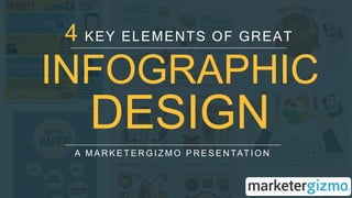
- 1. INFOGRAPHIC DESIGN A M A R K E T E R G I Z M O P R E S E N TAT I O N 4 KEY ELEMENTS OF GREAT
- 2. Elements of a Great Infographic Interesting Data or Information Visually Appealing Story Easy to Understand Design Optimal Shareability 4
- 3. { }1 CHOOSING A TOPIC (DATA NOT REQUIRED)
- 4. 53% OF THE MOST SHARED INFOGRAPHICS DO NOT ACTUALLY CONTAIN DATA VISUALIZATION. “ “
- 5. 4GREAT SOURCES OF INFOGRAPHIC TOPICS TIMELY ISSUEObservational Humor Novel Insights How To Timely Issue
- 6. How To Any instructional guide, such as the one to the right on how to make beer.
- 7. Insights Novel Any new way of looking at something, such as presenting new research or combining existing information in a new way.
- 8. Timely Graphics tied to news events or significant dates can easily capitalize on existing momentum. Issues
- 9. HUMOR Observational THE BIGGEST LIES ON THE INTERNET Pick up on trending memes or long-standing social phenomena or combine observations in a new way to come up with a humorous results.
- 10. { }2 TELLING A STORY DON’T BE BORING
- 11. Use a topic with a natural progression to guide your reader through the story
- 12. Use text, images, color, and space. Notice how your eye flows through this example without needing to read it up close. CREATE HIERARCHY
- 13. • Create a compelling visualization or clever revision of common information. • Offer an easy-to-understand version of big data • Provide an innovative solution. TEXT AND GRAPHICS MUST: (pick at least one)
- 14. { }3 DESIGNING THE “GRAPHIC” PART
- 15. 53% OF THE MOST SHARED INFOGRAPHICS DO NOT ACTUALLY CONTAIN DATA VISUALIZATION. “ “ REMEMBER…
- 17. REGARDLESS OF STYLE, FOLLOW THESE GUIDELINES
- 18. TIMELY ISSUE RESTRICT USE OF COLOR USE WHITE SPACE WISELY JUST A FEW FONT STYLES ESTABLISH HIERARCHY
- 19. { }4 SHAREABILITY LET THEM FIND & LIKE YOU
- 20. SEO Your Site Needs Making your infographic easy to find is typically a matter of larger site-wide SEO efforts. Make sure the page where your infographic lives also contains optimized content.
- 21. METADATA Your Page Needs Incorporate the keywords from your infographic into the meta title and description of the page itself to clearly demonstrate to search engines what the whole thing is about.
- 22. SHAREABILITY Your Infographic Needs • Create an embed code so people can repost the infographic • Format share-friendly sizes for popular social networks • Include logo and links to your social profiles on the infographic • Try recreating it as a SlideShare a few weeks after its initial launch
- 23. Sign up for our weekly Marketing Excellence Newsletter YOU GET: • Ear ly ac c es s to new guides lik e this one. • On- the - ground ins ight from our agile mar k eting team. • Quic k tips and bes t pr ac tic es that we tes t on our own mar k eting fir s t. READY FOR MORE? SIGN ME UP!
- 24. Read the full article on MarketerGizmo.com