SlideShare una empresa de Scribd logo
1 de 13
A good visualization clearly presents relationships
among many values, and lets you analyze data at a
glance. TravelOptix offers a range of visualizations
and charts. Each chart excels at visualizing data in
different ways for different purposes. You should
select your charts by deciding what you want to
see from the data in your charts.
In this lesson, we’ll show you some of the more
common chart types, and discuss how they would
be best used, and point out the advantages and
disadvantages to each.
Chart Types
You can include two dimensions and one
measure, or one dimension and multiple
measures in a bar chart. Each bar corresponds to
a dimension, and the values of the measures
determine the height/length of the bars.
Advantages Disadvantages
• Grouping and stacking bars makes it easy to visualize grouped data.
• The bar chart is also useful when you want to compare values side by side.
• Easy to read and understand.
• The bar chart does not work so well with many dimension values
• Limited to the axis lengths.
• You can scroll using the scroll bar, but then you might not get the full picture.
Bar Chart
The combo chart combines the features of the
bar chart and the line chart. You can use bars
and lines to represent different categorical
groups in the same visualization.
Advantages Disadvantages
• The best choice when combining several measures of different value ranges. • The combo chart only supports one dimension
• Can’t be used when you need to include two or more dimensions in the visualization.
Combo Chart
With filter panes, you can easily make several
selections to define your data set exactly like
you want it. With your well-defined data set, you
can explore data of particular interest.
By using the selection menu options in the filter
panes (select possible, select alternative, and
select excluded), you can make adjustments to
the data set and compare the results with the
previous selection.
Advantages Disadvantages
• Good for making selections and defining data sets.
• The green, white, and gray colors reflect the data associations that exist - and that do
not exist.
• Analyzing those associations, you can make new discoveries.
• When the dimensions contain a very large amount of values, it may be harder to
manage the data.
Filter Pane
The gauge is often used to present KPIs, for
example, on an executive dashboard, and
together with segmenting and color coding, it is
an effective way of illustrating a performance
result.
It is important to set relevant max and min
values to support the interpretation of the
value. You can use a reference line to provide
additional context.
Advantages Disadvantages
• A gauge is easy to read and understand and gives an instant indication of the
performance within an area.
• The gauge is quite space-demanding in relation to the single value it visualizes.
• The gauge is not always the best choice for presenting a single measure value.
• Deciding on the max and min values can indicate that some other visualization
should be used.
Gauge
Use KPIs to get an overview of performance
values that are central to an organization. Use
color coding and symbols to indicate how the
figures relate to the expected results.
Advantages Disadvantages
• KPIs give a quick understanding of the performance within an area. • The KPI is somewhat limited when it comes to graphical components.
• You can use symbols to help illustrate the performance, but if you want a more
conspicuous component, consider using a gauge.
KPI
The line chart is primarily suitable when you
want to visualize trends and movements over
time, where the dimension values are evenly
spaced, such as months, quarters, or fiscal years.
Your data set must consist of at least two data
points to draw a line. A data set with a single
value is displayed as a point.
Advantages Disadvantages
• The line chart is easy to understand and gives an instant perception of trends. • Using more than a few lines in a line chart makes the line chart cluttered and
hard to interpret.
• Avoid using more than two or three measures.
Line Chart
You can use a map to show the geographical
distribution of offices, stores, and other sites of
business interest. You can visualize not only
locations but also sales values and other
measures and display the value differences by
bubble size or color.
Advantages Disadvantages
• The map is a versatile visualization that efficiently presents the geographical
distribution of key values related to location or area.
• With a large number of values, it may be hard to get a good overview. Values
may be placed on top of each other and not visible until zoomed in.
Map
The primary use of a pie chart is to compare a
certain sector to the total. The pie chart is
particularly useful when there are only two
sectors, for example yes/no or queued/finished.
Advantages Disadvantages
• The pie chart provides an instant understanding of proportions when few
sectors are used as dimensions.
• When you use 10 sectors, or less, the pie chart keeps its visual efficiency.
• It is often hard to compare the results of two pie charts with each other, and
therefore you should not do it.
• It may be difficult to compare different sectors of a pie chart, especially a
chart with many sectors.
• The pie chart takes up a lot of space in relation to the values it visualizes.
Pie Chart
The pivot table presents dimensions and
measures as rows and columns of a table. The
pivot table allows you to analyze data by
multiple measures and in multiple dimensions at
the same time. The data in a pivot table may be
grouped based on a combination of the
dimensions. You can pivot by dragging and
dropping dimensions in the table.
Advantages Disadvantages
• The pivot table is very powerful when you want to analyze multiple
dimensions and measures
• You can expand the rows you are interested in while keeping the rows in the
rest of the table collapsed.
• The pivot table may seem a bit complicated, and does not give insights at a
glance.
Pivot Table
The scatter plot presents values from different
measures over one dimension as a collection of
points. For a scatter plot, the dimension is
represented by the points in the chart, and the
measures are found on each of the two axes.
When a third, optional, measure is used, its
value is reflected in the bubble size. When
analyzing large data sets and view compressed
data, the density of the data points is reflected
by color.
Advantages Disadvantages
• The scatter plot is a great way to visualize the correlation of two or more
measures at the same time.
• A third measure is an efficient way of differentiating between values and
simplifying the identification of large quantities.
• The scatter plot may be difficult to understand for an inexperienced user.
• Make sure a novice can interpret the scatter plot correctly.
• Using descriptive labels is a good way to make the visualization easier to
interpret.
• Values may be placed on top of each other and are then not visible until you
zoom in.
Scatter Plot
Use a table, when you want to view detailed
data and precise values rather than
visualizations of values. Tables are good when
you want to compare individual values. Drill-
down group dimensions are very efficient in
tables. Within a limited space, you can drill
down to the next level of detail and analyze the
updated measure values.
Advantages Disadvantages
• You can filter and sort the table in different ways. Many values can be
included in a table, and when you drill down in a table, you make good use of
a limited space of the sheet.
• A table is excellent when you want to see exact values rather than trends or
patterns.
• If the table contains many values, it is difficult to get an overview of how
values are related.
• It is also hard to identify an irregularity within the table.
Table
Treemaps are used to display hierarchical data.
You can drill down in the data, and the
theoretical number of levels is almost limitless.
You reach the practical limit before you reach
the theoretical limit.
Use a treemap when space is constrained and
you have a large amount of hierarchical data
that can be aggregated that you need to get an
overview of.
Advantages Disadvantages
• Treemaps can be used within a limited space and yet display a large number
of items simultaneously.
• When there is a correlation between color and size in the tree structure, you
are able to see patterns that would be difficult to spot in other ways.
• A treemap is not the right choice when mixing absolute and relative values.
• Negative values cannot be displayed in treemaps.
Treemap

Más contenido relacionado

La actualidad más candente

Simple graph types
Simple graph typesSimple graph types
Simple graph typesMahi Syama
 
diagrammatic and graphical representation of data
 diagrammatic and graphical representation of data diagrammatic and graphical representation of data
diagrammatic and graphical representation of dataVarun Prem Varu
 
Diagrammatic presentation of data
Diagrammatic presentation of dataDiagrammatic presentation of data
Diagrammatic presentation of dataAjita Gupta
 
Graphs and chars
Graphs and charsGraphs and chars
Graphs and charssalemhusin
 
statistics Diagrams
 statistics Diagrams statistics Diagrams
statistics Diagramsanil sharma
 
Tables and-figures-business-research
Tables and-figures-business-researchTables and-figures-business-research
Tables and-figures-business-researchrowenahurley1
 
Basics of Educational Statistics (Graphs & its Types)
Basics of Educational Statistics (Graphs & its Types)Basics of Educational Statistics (Graphs & its Types)
Basics of Educational Statistics (Graphs & its Types)HennaAnsari
 
Drawings, Tables, Graphs
Drawings, Tables, GraphsDrawings, Tables, Graphs
Drawings, Tables, GraphsDwayne Squires
 
Displaying data using charts and graphs
Displaying data using charts and graphsDisplaying data using charts and graphs
Displaying data using charts and graphsCharles Flynt
 
Types of graphs
Types of graphsTypes of graphs
Types of graphsbweldon
 
Types of graphs
Types of graphsTypes of graphs
Types of graphsLALIT BIST
 
Advantages and Limitations for Diagrams and Graphs
Advantages and Limitations for Diagrams and GraphsAdvantages and Limitations for Diagrams and Graphs
Advantages and Limitations for Diagrams and GraphsHardik Bhaavani
 
Statistics
StatisticsStatistics
Statisticsdiereck
 

La actualidad más candente (19)

Presentation of Data (thesis writing)
Presentation of Data (thesis writing)Presentation of Data (thesis writing)
Presentation of Data (thesis writing)
 
Simple graph types
Simple graph typesSimple graph types
Simple graph types
 
diagrammatic and graphical representation of data
 diagrammatic and graphical representation of data diagrammatic and graphical representation of data
diagrammatic and graphical representation of data
 
Diagrammatic presentation of data
Diagrammatic presentation of dataDiagrammatic presentation of data
Diagrammatic presentation of data
 
Graphs and chars
Graphs and charsGraphs and chars
Graphs and chars
 
statistics Diagrams
 statistics Diagrams statistics Diagrams
statistics Diagrams
 
Charts and graphs
Charts and graphsCharts and graphs
Charts and graphs
 
Types of Chart
Types of ChartTypes of Chart
Types of Chart
 
Tables and-figures-business-research
Tables and-figures-business-researchTables and-figures-business-research
Tables and-figures-business-research
 
Chp 4
Chp 4Chp 4
Chp 4
 
Basics of Educational Statistics (Graphs & its Types)
Basics of Educational Statistics (Graphs & its Types)Basics of Educational Statistics (Graphs & its Types)
Basics of Educational Statistics (Graphs & its Types)
 
Graphs
Graphs  Graphs
Graphs
 
Drawings, Tables, Graphs
Drawings, Tables, GraphsDrawings, Tables, Graphs
Drawings, Tables, Graphs
 
Charts And Graphs
Charts And GraphsCharts And Graphs
Charts And Graphs
 
Displaying data using charts and graphs
Displaying data using charts and graphsDisplaying data using charts and graphs
Displaying data using charts and graphs
 
Types of graphs
Types of graphsTypes of graphs
Types of graphs
 
Types of graphs
Types of graphsTypes of graphs
Types of graphs
 
Advantages and Limitations for Diagrams and Graphs
Advantages and Limitations for Diagrams and GraphsAdvantages and Limitations for Diagrams and Graphs
Advantages and Limitations for Diagrams and Graphs
 
Statistics
StatisticsStatistics
Statistics
 

Similar a Chart types

DATA GRAPHICS 8th Sem.pdf
DATA GRAPHICS 8th Sem.pdfDATA GRAPHICS 8th Sem.pdf
DATA GRAPHICS 8th Sem.pdfRavinandan A P
 
Applied GIS - 3022.pptx
Applied GIS - 3022.pptxApplied GIS - 3022.pptx
Applied GIS - 3022.pptxtemesgenabebe1
 
Tableau Desktop Specialist Certification.pptx
Tableau Desktop Specialist Certification.pptxTableau Desktop Specialist Certification.pptx
Tableau Desktop Specialist Certification.pptxHarshavardhiniYeluri
 
introduction to statistics
introduction to statisticsintroduction to statistics
introduction to statisticsBasit00786
 
BUSINESS INTELLIGENCE AND DATA ANALYTICS presentation
BUSINESS INTELLIGENCE AND DATA ANALYTICS  presentationBUSINESS INTELLIGENCE AND DATA ANALYTICS  presentation
BUSINESS INTELLIGENCE AND DATA ANALYTICS presentationMohit Negi
 
Hanan's presentation.pptx
Hanan's presentation.pptxHanan's presentation.pptx
Hanan's presentation.pptxsaimwaheed2
 
How to visualize web analytics data and choose a graph?
How to visualize web analytics data and choose a graph?How to visualize web analytics data and choose a graph?
How to visualize web analytics data and choose a graph?Janvi Arora
 
Storytelling with data and data visualization
Storytelling with data and data visualizationStorytelling with data and data visualization
Storytelling with data and data visualizationFrehiwot Mulugeta
 
GRAPHIC ORGANIZERS (DESCRIPTION AND TYPES).pptx
GRAPHIC ORGANIZERS (DESCRIPTION AND TYPES).pptxGRAPHIC ORGANIZERS (DESCRIPTION AND TYPES).pptx
GRAPHIC ORGANIZERS (DESCRIPTION AND TYPES).pptxoraylislie02
 
Numerical & graphical presentation of data
Numerical & graphical presentation of dataNumerical & graphical presentation of data
Numerical & graphical presentation of dataSarfraz Ahmad
 
Chapter 4 - Research Parts Guide.pptx
Chapter 4 - Research Parts Guide.pptxChapter 4 - Research Parts Guide.pptx
Chapter 4 - Research Parts Guide.pptxGelmelinaLeaLepitenH
 
The Gauge & Widget Advantage for your Dashboard
The Gauge & Widget Advantage for your DashboardThe Gauge & Widget Advantage for your Dashboard
The Gauge & Widget Advantage for your DashboardFusionCharts
 
Diowane2003
Diowane2003Diowane2003
Diowane2003SFYC
 

Similar a Chart types (20)

DATA GRAPHICS 8th Sem.pdf
DATA GRAPHICS 8th Sem.pdfDATA GRAPHICS 8th Sem.pdf
DATA GRAPHICS 8th Sem.pdf
 
Data Visualization.pptx
Data Visualization.pptxData Visualization.pptx
Data Visualization.pptx
 
Power BI.pdf
Power BI.pdfPower BI.pdf
Power BI.pdf
 
Applied GIS - 3022.pptx
Applied GIS - 3022.pptxApplied GIS - 3022.pptx
Applied GIS - 3022.pptx
 
Tableau Desktop Specialist Certification.pptx
Tableau Desktop Specialist Certification.pptxTableau Desktop Specialist Certification.pptx
Tableau Desktop Specialist Certification.pptx
 
introduction to statistics
introduction to statisticsintroduction to statistics
introduction to statistics
 
BUSINESS INTELLIGENCE AND DATA ANALYTICS presentation
BUSINESS INTELLIGENCE AND DATA ANALYTICS  presentationBUSINESS INTELLIGENCE AND DATA ANALYTICS  presentation
BUSINESS INTELLIGENCE AND DATA ANALYTICS presentation
 
Bigdata
BigdataBigdata
Bigdata
 
Unit 3 ppt.pptx
Unit 3 ppt.pptxUnit 3 ppt.pptx
Unit 3 ppt.pptx
 
Hanan's presentation.pptx
Hanan's presentation.pptxHanan's presentation.pptx
Hanan's presentation.pptx
 
How to visualize web analytics data and choose a graph?
How to visualize web analytics data and choose a graph?How to visualize web analytics data and choose a graph?
How to visualize web analytics data and choose a graph?
 
Storytelling with data and data visualization
Storytelling with data and data visualizationStorytelling with data and data visualization
Storytelling with data and data visualization
 
GRAPHIC ORGANIZERS (DESCRIPTION AND TYPES).pptx
GRAPHIC ORGANIZERS (DESCRIPTION AND TYPES).pptxGRAPHIC ORGANIZERS (DESCRIPTION AND TYPES).pptx
GRAPHIC ORGANIZERS (DESCRIPTION AND TYPES).pptx
 
Numerical & graphical presentation of data
Numerical & graphical presentation of dataNumerical & graphical presentation of data
Numerical & graphical presentation of data
 
Data mining
Data miningData mining
Data mining
 
Chapter 4 - Research Parts Guide.pptx
Chapter 4 - Research Parts Guide.pptxChapter 4 - Research Parts Guide.pptx
Chapter 4 - Research Parts Guide.pptx
 
Graphs in Biostatistics
Graphs in Biostatistics Graphs in Biostatistics
Graphs in Biostatistics
 
The Gauge & Widget Advantage for your Dashboard
The Gauge & Widget Advantage for your DashboardThe Gauge & Widget Advantage for your Dashboard
The Gauge & Widget Advantage for your Dashboard
 
Graph
GraphGraph
Graph
 
Diowane2003
Diowane2003Diowane2003
Diowane2003
 

Último

NO1 Certified Black Magic Specialist Expert Amil baba in Lahore Islamabad Raw...
NO1 Certified Black Magic Specialist Expert Amil baba in Lahore Islamabad Raw...NO1 Certified Black Magic Specialist Expert Amil baba in Lahore Islamabad Raw...
NO1 Certified Black Magic Specialist Expert Amil baba in Lahore Islamabad Raw...Amil Baba Dawood bangali
 
Data Factory in Microsoft Fabric (MsBIP #82)
Data Factory in Microsoft Fabric (MsBIP #82)Data Factory in Microsoft Fabric (MsBIP #82)
Data Factory in Microsoft Fabric (MsBIP #82)Cathrine Wilhelmsen
 
Predictive Analysis for Loan Default Presentation : Data Analysis Project PPT
Predictive Analysis for Loan Default  Presentation : Data Analysis Project PPTPredictive Analysis for Loan Default  Presentation : Data Analysis Project PPT
Predictive Analysis for Loan Default Presentation : Data Analysis Project PPTBoston Institute of Analytics
 
convolutional neural network and its applications.pdf
convolutional neural network and its applications.pdfconvolutional neural network and its applications.pdf
convolutional neural network and its applications.pdfSubhamKumar3239
 
Unveiling the Role of Social Media Suspect Investigators in Preventing Online...
Unveiling the Role of Social Media Suspect Investigators in Preventing Online...Unveiling the Role of Social Media Suspect Investigators in Preventing Online...
Unveiling the Role of Social Media Suspect Investigators in Preventing Online...Milind Agarwal
 
Networking Case Study prepared by teacher.pptx
Networking Case Study prepared by teacher.pptxNetworking Case Study prepared by teacher.pptx
Networking Case Study prepared by teacher.pptxHimangsuNath
 
Data Analysis Project : Targeting the Right Customers, Presentation on Bank M...
Data Analysis Project : Targeting the Right Customers, Presentation on Bank M...Data Analysis Project : Targeting the Right Customers, Presentation on Bank M...
Data Analysis Project : Targeting the Right Customers, Presentation on Bank M...Boston Institute of Analytics
 
SMOTE and K-Fold Cross Validation-Presentation.pptx
SMOTE and K-Fold Cross Validation-Presentation.pptxSMOTE and K-Fold Cross Validation-Presentation.pptx
SMOTE and K-Fold Cross Validation-Presentation.pptxHaritikaChhatwal1
 
Conf42-LLM_Adding Generative AI to Real-Time Streaming Pipelines
Conf42-LLM_Adding Generative AI to Real-Time Streaming PipelinesConf42-LLM_Adding Generative AI to Real-Time Streaming Pipelines
Conf42-LLM_Adding Generative AI to Real-Time Streaming PipelinesTimothy Spann
 
Advanced Machine Learning for Business Professionals
Advanced Machine Learning for Business ProfessionalsAdvanced Machine Learning for Business Professionals
Advanced Machine Learning for Business ProfessionalsVICTOR MAESTRE RAMIREZ
 
FAIR, FAIRsharing, FAIR Cookbook and ELIXIR - Sansone SA - Boston 2024
FAIR, FAIRsharing, FAIR Cookbook and ELIXIR - Sansone SA - Boston 2024FAIR, FAIRsharing, FAIR Cookbook and ELIXIR - Sansone SA - Boston 2024
FAIR, FAIRsharing, FAIR Cookbook and ELIXIR - Sansone SA - Boston 2024Susanna-Assunta Sansone
 
Minimizing AI Hallucinations/Confabulations and the Path towards AGI with Exa...
Minimizing AI Hallucinations/Confabulations and the Path towards AGI with Exa...Minimizing AI Hallucinations/Confabulations and the Path towards AGI with Exa...
Minimizing AI Hallucinations/Confabulations and the Path towards AGI with Exa...Thomas Poetter
 
Cyber awareness ppt on the recorded data
Cyber awareness ppt on the recorded dataCyber awareness ppt on the recorded data
Cyber awareness ppt on the recorded dataTecnoIncentive
 
The Power of Data-Driven Storytelling_ Unveiling the Layers of Insight.pptx
The Power of Data-Driven Storytelling_ Unveiling the Layers of Insight.pptxThe Power of Data-Driven Storytelling_ Unveiling the Layers of Insight.pptx
The Power of Data-Driven Storytelling_ Unveiling the Layers of Insight.pptxTasha Penwell
 
Student Profile Sample report on improving academic performance by uniting gr...
Student Profile Sample report on improving academic performance by uniting gr...Student Profile Sample report on improving academic performance by uniting gr...
Student Profile Sample report on improving academic performance by uniting gr...Seán Kennedy
 
English-8-Q4-W3-Synthesizing-Essential-Information-From-Various-Sources-1.pdf
English-8-Q4-W3-Synthesizing-Essential-Information-From-Various-Sources-1.pdfEnglish-8-Q4-W3-Synthesizing-Essential-Information-From-Various-Sources-1.pdf
English-8-Q4-W3-Synthesizing-Essential-Information-From-Various-Sources-1.pdfblazblazml
 
Digital Marketing Plan, how digital marketing works
Digital Marketing Plan, how digital marketing worksDigital Marketing Plan, how digital marketing works
Digital Marketing Plan, how digital marketing worksdeepakthakur548787
 
modul pembelajaran robotic Workshop _ by Slidesgo.pptx
modul pembelajaran robotic Workshop _ by Slidesgo.pptxmodul pembelajaran robotic Workshop _ by Slidesgo.pptx
modul pembelajaran robotic Workshop _ by Slidesgo.pptxaleedritatuxx
 
Semantic Shed - Squashing and Squeezing.pptx
Semantic Shed - Squashing and Squeezing.pptxSemantic Shed - Squashing and Squeezing.pptx
Semantic Shed - Squashing and Squeezing.pptxMike Bennett
 

Último (20)

NO1 Certified Black Magic Specialist Expert Amil baba in Lahore Islamabad Raw...
NO1 Certified Black Magic Specialist Expert Amil baba in Lahore Islamabad Raw...NO1 Certified Black Magic Specialist Expert Amil baba in Lahore Islamabad Raw...
NO1 Certified Black Magic Specialist Expert Amil baba in Lahore Islamabad Raw...
 
Data Factory in Microsoft Fabric (MsBIP #82)
Data Factory in Microsoft Fabric (MsBIP #82)Data Factory in Microsoft Fabric (MsBIP #82)
Data Factory in Microsoft Fabric (MsBIP #82)
 
Predictive Analysis for Loan Default Presentation : Data Analysis Project PPT
Predictive Analysis for Loan Default  Presentation : Data Analysis Project PPTPredictive Analysis for Loan Default  Presentation : Data Analysis Project PPT
Predictive Analysis for Loan Default Presentation : Data Analysis Project PPT
 
convolutional neural network and its applications.pdf
convolutional neural network and its applications.pdfconvolutional neural network and its applications.pdf
convolutional neural network and its applications.pdf
 
Unveiling the Role of Social Media Suspect Investigators in Preventing Online...
Unveiling the Role of Social Media Suspect Investigators in Preventing Online...Unveiling the Role of Social Media Suspect Investigators in Preventing Online...
Unveiling the Role of Social Media Suspect Investigators in Preventing Online...
 
Networking Case Study prepared by teacher.pptx
Networking Case Study prepared by teacher.pptxNetworking Case Study prepared by teacher.pptx
Networking Case Study prepared by teacher.pptx
 
Data Analysis Project : Targeting the Right Customers, Presentation on Bank M...
Data Analysis Project : Targeting the Right Customers, Presentation on Bank M...Data Analysis Project : Targeting the Right Customers, Presentation on Bank M...
Data Analysis Project : Targeting the Right Customers, Presentation on Bank M...
 
SMOTE and K-Fold Cross Validation-Presentation.pptx
SMOTE and K-Fold Cross Validation-Presentation.pptxSMOTE and K-Fold Cross Validation-Presentation.pptx
SMOTE and K-Fold Cross Validation-Presentation.pptx
 
Conf42-LLM_Adding Generative AI to Real-Time Streaming Pipelines
Conf42-LLM_Adding Generative AI to Real-Time Streaming PipelinesConf42-LLM_Adding Generative AI to Real-Time Streaming Pipelines
Conf42-LLM_Adding Generative AI to Real-Time Streaming Pipelines
 
Advanced Machine Learning for Business Professionals
Advanced Machine Learning for Business ProfessionalsAdvanced Machine Learning for Business Professionals
Advanced Machine Learning for Business Professionals
 
FAIR, FAIRsharing, FAIR Cookbook and ELIXIR - Sansone SA - Boston 2024
FAIR, FAIRsharing, FAIR Cookbook and ELIXIR - Sansone SA - Boston 2024FAIR, FAIRsharing, FAIR Cookbook and ELIXIR - Sansone SA - Boston 2024
FAIR, FAIRsharing, FAIR Cookbook and ELIXIR - Sansone SA - Boston 2024
 
Minimizing AI Hallucinations/Confabulations and the Path towards AGI with Exa...
Minimizing AI Hallucinations/Confabulations and the Path towards AGI with Exa...Minimizing AI Hallucinations/Confabulations and the Path towards AGI with Exa...
Minimizing AI Hallucinations/Confabulations and the Path towards AGI with Exa...
 
Insurance Churn Prediction Data Analysis Project
Insurance Churn Prediction Data Analysis ProjectInsurance Churn Prediction Data Analysis Project
Insurance Churn Prediction Data Analysis Project
 
Cyber awareness ppt on the recorded data
Cyber awareness ppt on the recorded dataCyber awareness ppt on the recorded data
Cyber awareness ppt on the recorded data
 
The Power of Data-Driven Storytelling_ Unveiling the Layers of Insight.pptx
The Power of Data-Driven Storytelling_ Unveiling the Layers of Insight.pptxThe Power of Data-Driven Storytelling_ Unveiling the Layers of Insight.pptx
The Power of Data-Driven Storytelling_ Unveiling the Layers of Insight.pptx
 
Student Profile Sample report on improving academic performance by uniting gr...
Student Profile Sample report on improving academic performance by uniting gr...Student Profile Sample report on improving academic performance by uniting gr...
Student Profile Sample report on improving academic performance by uniting gr...
 
English-8-Q4-W3-Synthesizing-Essential-Information-From-Various-Sources-1.pdf
English-8-Q4-W3-Synthesizing-Essential-Information-From-Various-Sources-1.pdfEnglish-8-Q4-W3-Synthesizing-Essential-Information-From-Various-Sources-1.pdf
English-8-Q4-W3-Synthesizing-Essential-Information-From-Various-Sources-1.pdf
 
Digital Marketing Plan, how digital marketing works
Digital Marketing Plan, how digital marketing worksDigital Marketing Plan, how digital marketing works
Digital Marketing Plan, how digital marketing works
 
modul pembelajaran robotic Workshop _ by Slidesgo.pptx
modul pembelajaran robotic Workshop _ by Slidesgo.pptxmodul pembelajaran robotic Workshop _ by Slidesgo.pptx
modul pembelajaran robotic Workshop _ by Slidesgo.pptx
 
Semantic Shed - Squashing and Squeezing.pptx
Semantic Shed - Squashing and Squeezing.pptxSemantic Shed - Squashing and Squeezing.pptx
Semantic Shed - Squashing and Squeezing.pptx
 

Chart types

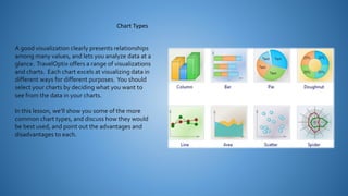
  • 1. A good visualization clearly presents relationships among many values, and lets you analyze data at a glance. TravelOptix offers a range of visualizations and charts. Each chart excels at visualizing data in different ways for different purposes. You should select your charts by deciding what you want to see from the data in your charts. In this lesson, we’ll show you some of the more common chart types, and discuss how they would be best used, and point out the advantages and disadvantages to each. Chart Types
  • 2. You can include two dimensions and one measure, or one dimension and multiple measures in a bar chart. Each bar corresponds to a dimension, and the values of the measures determine the height/length of the bars. Advantages Disadvantages • Grouping and stacking bars makes it easy to visualize grouped data. • The bar chart is also useful when you want to compare values side by side. • Easy to read and understand. • The bar chart does not work so well with many dimension values • Limited to the axis lengths. • You can scroll using the scroll bar, but then you might not get the full picture. Bar Chart
  • 3. The combo chart combines the features of the bar chart and the line chart. You can use bars and lines to represent different categorical groups in the same visualization. Advantages Disadvantages • The best choice when combining several measures of different value ranges. • The combo chart only supports one dimension • Can’t be used when you need to include two or more dimensions in the visualization. Combo Chart
  • 4. With filter panes, you can easily make several selections to define your data set exactly like you want it. With your well-defined data set, you can explore data of particular interest. By using the selection menu options in the filter panes (select possible, select alternative, and select excluded), you can make adjustments to the data set and compare the results with the previous selection. Advantages Disadvantages • Good for making selections and defining data sets. • The green, white, and gray colors reflect the data associations that exist - and that do not exist. • Analyzing those associations, you can make new discoveries. • When the dimensions contain a very large amount of values, it may be harder to manage the data. Filter Pane
  • 5. The gauge is often used to present KPIs, for example, on an executive dashboard, and together with segmenting and color coding, it is an effective way of illustrating a performance result. It is important to set relevant max and min values to support the interpretation of the value. You can use a reference line to provide additional context. Advantages Disadvantages • A gauge is easy to read and understand and gives an instant indication of the performance within an area. • The gauge is quite space-demanding in relation to the single value it visualizes. • The gauge is not always the best choice for presenting a single measure value. • Deciding on the max and min values can indicate that some other visualization should be used. Gauge
  • 6. Use KPIs to get an overview of performance values that are central to an organization. Use color coding and symbols to indicate how the figures relate to the expected results. Advantages Disadvantages • KPIs give a quick understanding of the performance within an area. • The KPI is somewhat limited when it comes to graphical components. • You can use symbols to help illustrate the performance, but if you want a more conspicuous component, consider using a gauge. KPI
  • 7. The line chart is primarily suitable when you want to visualize trends and movements over time, where the dimension values are evenly spaced, such as months, quarters, or fiscal years. Your data set must consist of at least two data points to draw a line. A data set with a single value is displayed as a point. Advantages Disadvantages • The line chart is easy to understand and gives an instant perception of trends. • Using more than a few lines in a line chart makes the line chart cluttered and hard to interpret. • Avoid using more than two or three measures. Line Chart
  • 8. You can use a map to show the geographical distribution of offices, stores, and other sites of business interest. You can visualize not only locations but also sales values and other measures and display the value differences by bubble size or color. Advantages Disadvantages • The map is a versatile visualization that efficiently presents the geographical distribution of key values related to location or area. • With a large number of values, it may be hard to get a good overview. Values may be placed on top of each other and not visible until zoomed in. Map
  • 9. The primary use of a pie chart is to compare a certain sector to the total. The pie chart is particularly useful when there are only two sectors, for example yes/no or queued/finished. Advantages Disadvantages • The pie chart provides an instant understanding of proportions when few sectors are used as dimensions. • When you use 10 sectors, or less, the pie chart keeps its visual efficiency. • It is often hard to compare the results of two pie charts with each other, and therefore you should not do it. • It may be difficult to compare different sectors of a pie chart, especially a chart with many sectors. • The pie chart takes up a lot of space in relation to the values it visualizes. Pie Chart
  • 10. The pivot table presents dimensions and measures as rows and columns of a table. The pivot table allows you to analyze data by multiple measures and in multiple dimensions at the same time. The data in a pivot table may be grouped based on a combination of the dimensions. You can pivot by dragging and dropping dimensions in the table. Advantages Disadvantages • The pivot table is very powerful when you want to analyze multiple dimensions and measures • You can expand the rows you are interested in while keeping the rows in the rest of the table collapsed. • The pivot table may seem a bit complicated, and does not give insights at a glance. Pivot Table
  • 11. The scatter plot presents values from different measures over one dimension as a collection of points. For a scatter plot, the dimension is represented by the points in the chart, and the measures are found on each of the two axes. When a third, optional, measure is used, its value is reflected in the bubble size. When analyzing large data sets and view compressed data, the density of the data points is reflected by color. Advantages Disadvantages • The scatter plot is a great way to visualize the correlation of two or more measures at the same time. • A third measure is an efficient way of differentiating between values and simplifying the identification of large quantities. • The scatter plot may be difficult to understand for an inexperienced user. • Make sure a novice can interpret the scatter plot correctly. • Using descriptive labels is a good way to make the visualization easier to interpret. • Values may be placed on top of each other and are then not visible until you zoom in. Scatter Plot
  • 12. Use a table, when you want to view detailed data and precise values rather than visualizations of values. Tables are good when you want to compare individual values. Drill- down group dimensions are very efficient in tables. Within a limited space, you can drill down to the next level of detail and analyze the updated measure values. Advantages Disadvantages • You can filter and sort the table in different ways. Many values can be included in a table, and when you drill down in a table, you make good use of a limited space of the sheet. • A table is excellent when you want to see exact values rather than trends or patterns. • If the table contains many values, it is difficult to get an overview of how values are related. • It is also hard to identify an irregularity within the table. Table
  • 13. Treemaps are used to display hierarchical data. You can drill down in the data, and the theoretical number of levels is almost limitless. You reach the practical limit before you reach the theoretical limit. Use a treemap when space is constrained and you have a large amount of hierarchical data that can be aggregated that you need to get an overview of. Advantages Disadvantages • Treemaps can be used within a limited space and yet display a large number of items simultaneously. • When there is a correlation between color and size in the tree structure, you are able to see patterns that would be difficult to spot in other ways. • A treemap is not the right choice when mixing absolute and relative values. • Negative values cannot be displayed in treemaps. Treemap