Say it with drawings: 5 Things I Discovered Through Cartooning
•Descargar como PPTX, PDF•
0 recomendaciones•885 vistas

This document discusses how illustrations and comics can be used to effectively communicate information and stories within organizations. It provides examples of the author's work using illustrations for internal change programs and event visuals. The author explains things they have learned, such as how a narrative infographic can be quicker to create than a video, and how drawing can help explain abstract or boring concepts. They advocate using illustrations to break information into small, linear chunks and tell stories to promote new beliefs. The document concludes with proposing workshops to use comic strips to map problems or collect stories within an organization.

Recomendados
Recomendados
Más contenido relacionado
La actualidad más candente
Similar a Say it with drawings: 5 Things I Discovered Through Cartooning
Similar a Say it with drawings: 5 Things I Discovered Through Cartooning (20)
Más de Business illustrator (Business Goes Social)
Más de Business illustrator (Business Goes Social) (10)
Último
Último (20)
Say it with drawings: 5 Things I Discovered Through Cartooning
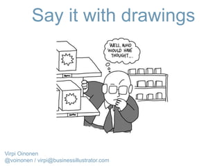
- 1. Say it with drawings Virpi Oinonen @voinonen / virpi@businessillustrator.com
- 2. My work: Internal change programmes
- 3. 5 Things I Discovered Through Cartooning Virpi Oinonen @voinonen
- 4. Two problems: - (lack of) Shareability and stickiness in corporate change communication - There is too much Top down communication
- 5. How I ended up doing what I do I blame this guy
- 6. Stuff I’ve learnt: it’s QUICKER to do a good “Narrative INFOGRAPHIC” than a good video/animation It’s also a flexible format
- 7. Stuff I’ve learnt: If it’s abstract (or boring) DRAW IT
- 8. RSA ANIMATE
- 9. My work: Event visuals
- 10. Stuff I’ve learnt: . Don’t overwhelm people : Break things down into linear small chunks
- 11. This format is problematic:
- 12. I use a Narrative approach instead: Infographic or Slideshare (ppt) work well
- 13. Always try to build a story – even if there isn’t one Stuff I’ve learnt:
- 14. From infographic “What is service design”
- 17. “If you give people facts without a story, they will explain it within their existing belief system. The best way to promote a new or different belief is not with facts, but with a story”. - Dave gray Bear in mind:
- 18. Want to Engage people? First address their frustration Stuff I’ve learnt:
- 23. Stuff I’ve learnt: If it’s something negative Draw it! (humour also helps)
- 24. Darryl Cunningham: Psychiatric Tales
- 25. When things are in a flux draw by hand (the wobblier the better) Stuff I’ve learnt:
- 26. “perfection kills engagement”. . .
- 27. Stuff I’ve learnt: FACIAL EXPRESSIONS matter a great deal
- 29. Inspiration
- 30. XKCD
- 31. Dilbert by Scott Adams
- 32. Stuff I’ve learnt: Employees/clients have great ideas CO-CREATE !
- 34. Darryl cunningham (from “Supercrash”)
- 35. The oatmeal
- 36. My approach / philosophy: If it’s important then everyone should be able to understand it Keep things Simple but smart Try not to bore people
- 37. WORKSHOP: Turn a problem into a comic strip
- 39. TASK: comic strip about a problem 1st Panel: I / we want. . . ( THE GOAL ) 2nd panel: BUT . . . ( The obstacle ) 3rd panel: So. . . (How things suck because we can’t reach our goal)
- 40. 3 PANEL STRIP COMIC strip formats 6 PANEL STRIP
- 41. How comics/comics workshops could help your organisation? “culture mapping” exercise ? (good when dealing with the negative, unspoken rules!) Solving problems? Getting everyone on the same page before a big project/initiative? As a way to collect and share stories of people or teams who are already doing things the new way Customer journey mapping what else …?BENEFITS : - deal with negativity - shareable content - have fun
- 42. Questions? Comments? Please remember to give feedback :) @voinonen virpi@businessillustrator.com
Notas del editor
- My very confusing professional background
- THE QUESTION: Would it make sense to work in other contexts???
- ORGANISATIONS ARE FASCINATING I’ve always been interested in organisations and how humans behave. Background in social collaboration consultancy: (how many of you use a collaboration tool?)
- My background is in digital campaigning where these are key themes
- I was given two days to develop digital website and content for the campaign. Key tool: Wacom tablet.
- Stand alone visuals, The media could pick up bits they liked.
- This was drawn on iPad 2. I now use a crappy Windows tablet and a Samsung tablet.
- The problem: no story to follow, reveals too much at the same time. This was produced after the event. They could have turned it into something easier to follow.
- The idea is to reveal things bit by bit: VERTICAL works PPT works
- construct a fictional story that acts as “narrative glue” for facts. Why I did it: the goal was to get to talk to service designers. I had no professional connections to the field. Approach: visualise a professional pain point (clients don’t know what Service design is), also acknowledge frustrations. (Frustrations are great, great content for comics). Like a good service designers I went to observe service designsers in their own habitat… In company context: showing frustrations and problems in this way are less threatening than if it was in written format or in video
- DO NOT UNDERESTIMATE THE POWER OF STORYTELLING
- DO NOT UNDERESTIMATE THE POWER OF STORYTELLING
- DO NOT UNDERESTIMATE THE POWER OF STORYTELLING
- Clients aren’t necessarily aware of this when they commission me but I think they are subconsciously aware of it… Hand drawn illustrations also make things more human
- Industries vary from tech to insurance to government departments: including Fnnish PM’s office
- Case medical cartoons.. In organisational context can defuse the negativity a bit.
- Clients aren’t necessarily aware of this when they commission me but I think they are subconsciously aware of it… Hand drawn illustrations also make things more human “appropriate level of fidelity”
- What you think you communicate with slick photos: professionalism, success etc. What you accidentally communicate: YOU HAVE NO SAY AND YOU SWITCH OFF things have been decided and this consultation etc is a tick box exercise The more expensive looking the visuals the more likely people will think things have been decided and they won’t have to engage with anything
- With drawings it’s easy to exaggerate
- Dilbert is interesting because the artist is actually not an artist but a business person/engineer who uses his insights of the corporate world: mediocre engineer, mediocre business man and a mediocre cartoonist: but interesting is the VENN diagram of skills and knowledge that overlap. ALSO: he actually crowdsources ideas to his audience
- Except traditional communications people: very unimaginitive people who think they know how to communicate (in a pushy broadcasty way).
- Stand alone visuals, The media could pick up bits they liked.
- Overlap between professions: not an illustrator, not marketing, not communications officer – but all of them
- Draw a cat Draw a dog -draw a cat with an identity crisis Draw love Draw frustration
- Personal level: kids not cleaning their rooms, your toaster that doesn’t work Work level: Project goal, Society level: Brexit, Frustration
- PROBLEM WITH CURRENT WORKSHOPS (post-it notes, improv etc) NOTHING SHAREABLE What is produced is hard to share. It’s dull. There are countless reports that gather virtual dust in a shared folder somewhere. What’s the point? Post-it notes and writing only engage part of the brain. CULTURE increasingly important: “culture eats strategy for breakfast) workshops as tools for - solving problems - getting everyone (literally) on the same page before a big project or initiative - a way to get people to share good stories/solutions and help them spread wider inside a company (maybe turn into a booklet) - as a culture mapping exercise (when there are a lot of unspoken rules, maybe threatening ideas - soften them a bit) - as an exercise to list behaviours/ways of thinking that are not desirable, as well as list the desired behaviours
- Overlap between professions: not an illustrator, not marketing, not communications officer – but all of them